0 to 1 Product DesignUser ResearchPrototypingAI ProductUCLA Extension 2022
Swing With Me — An AI Stroke Coach in Your Pocket
I played Division I tennis at UC Riverside. I know exactly what it feels like to have a technical flaw you can't fix without someone watching. I designed this app to be that someone — records your strokes, compares them frame-by-frame to a pro's form, and delivers the coaching feedback most players can't afford.
UX Designer (Solo)
12 weeks
Adobe XD, Figma, InVision
UCLA Extension, Summer 2022
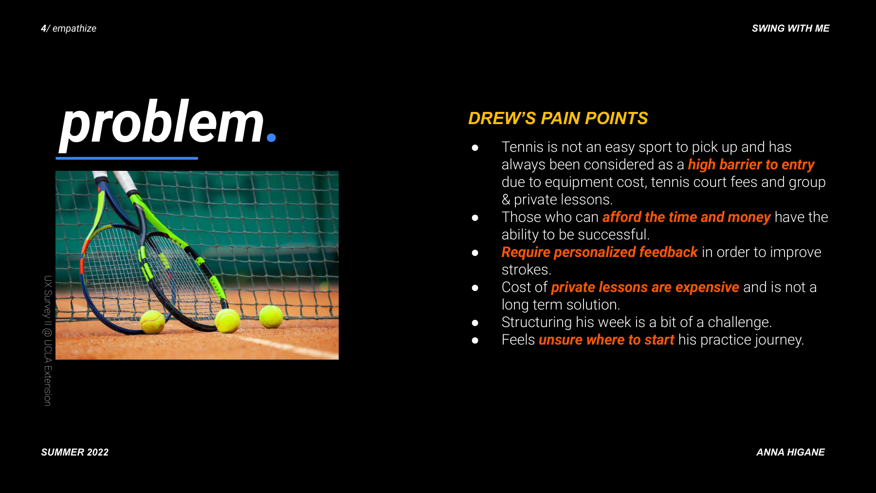
01 — The Problem
Getting better at tennis without a coach is nearly impossible — unless you build the coach.
Tennis improvement requires real-time, specific feedback from someone watching you. Without a coach, you keep reverting to the same bad habits. I designed an app that does what a coach does: breaks down where your form differs from a pro's, stroke by stroke.
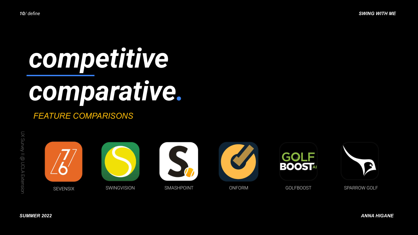
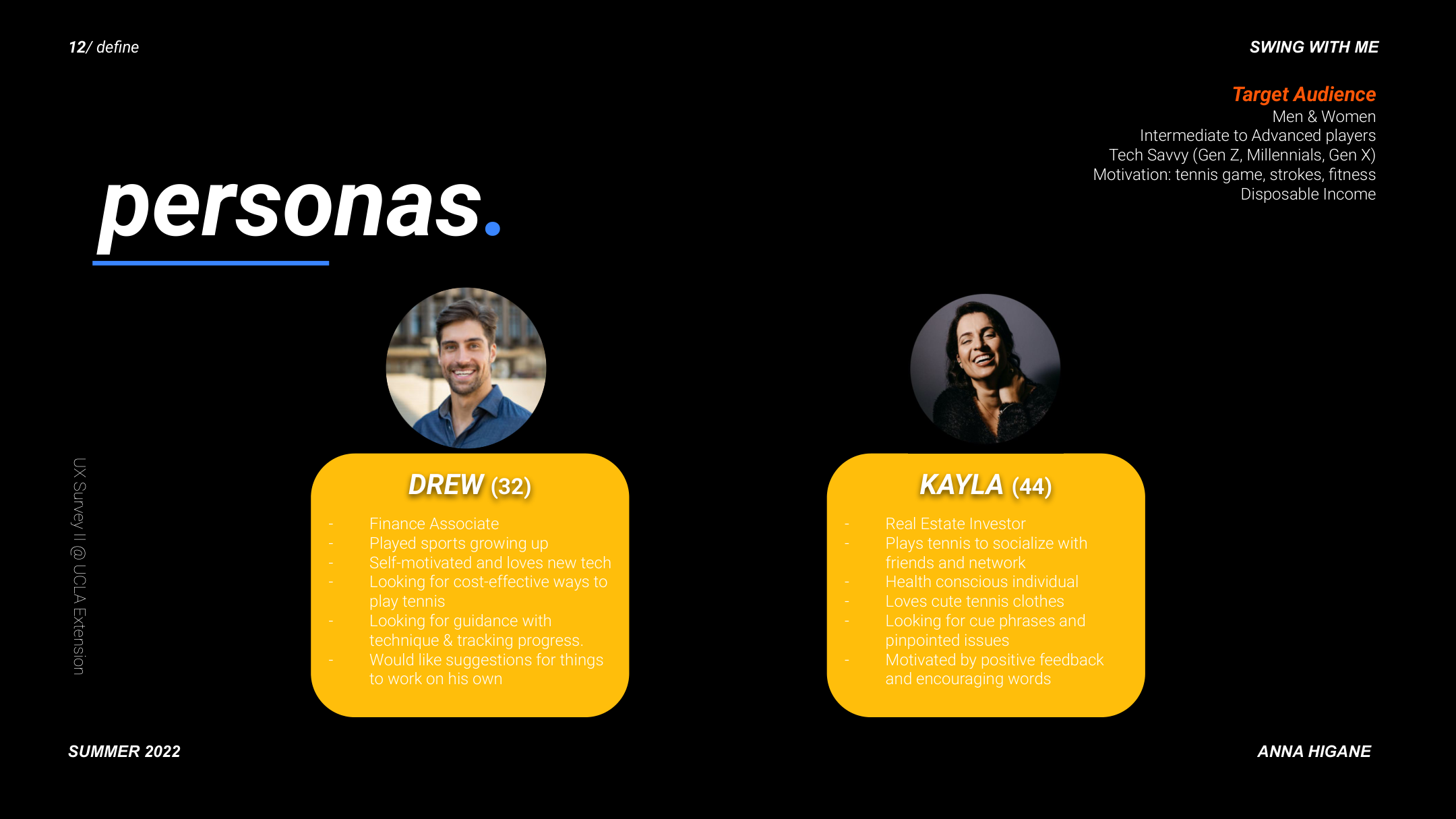
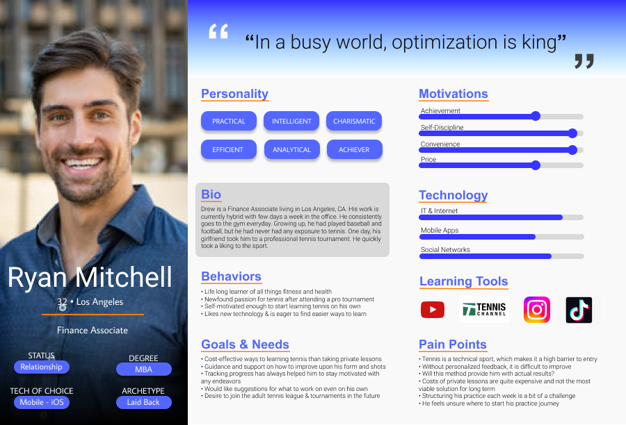
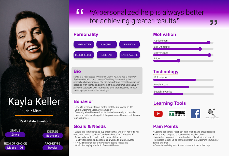
02 — Research
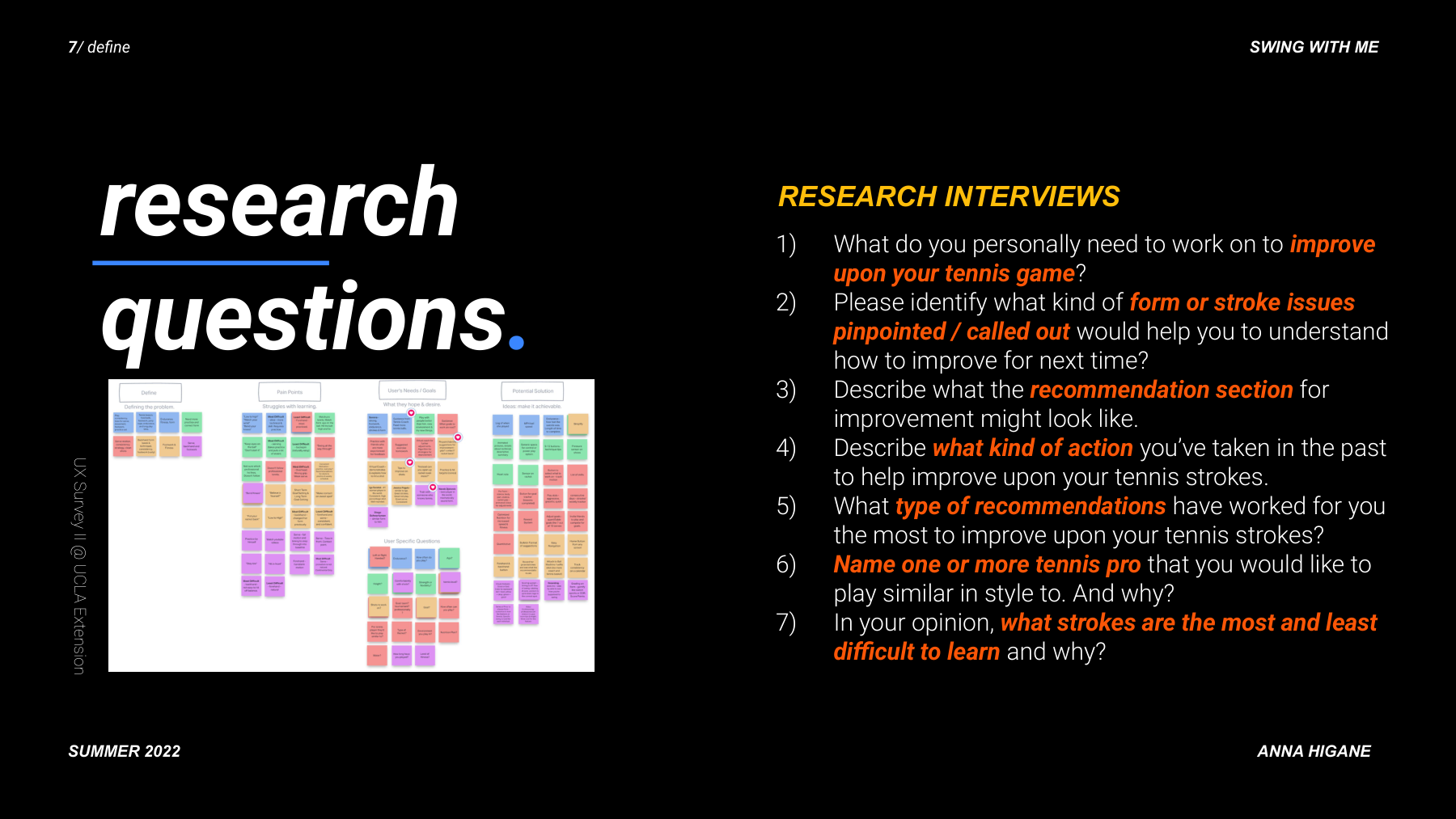
Five interviews. One critical pivot: drop the beginners.
I interviewed recreational tennis players across skill levels and ran a competitive analysis across 6 existing apps. The biggest finding was about audience, not features.
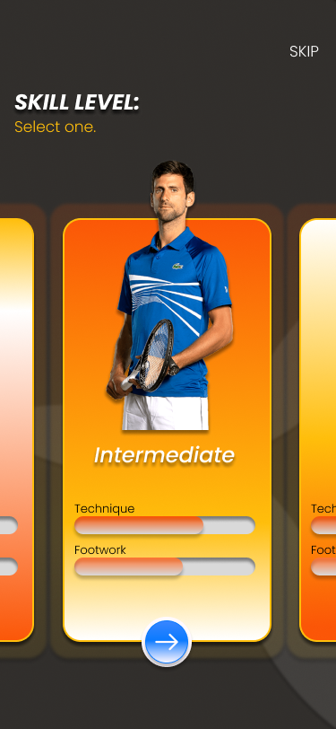
Beginners needed foundational instruction first. Intermediate players had specific, named problems. I pivoted to intermediate players, which simplified every subsequent design decision.
03 — Process
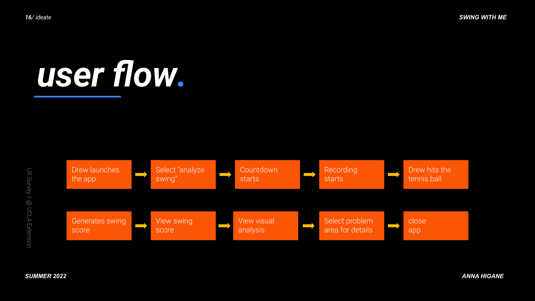
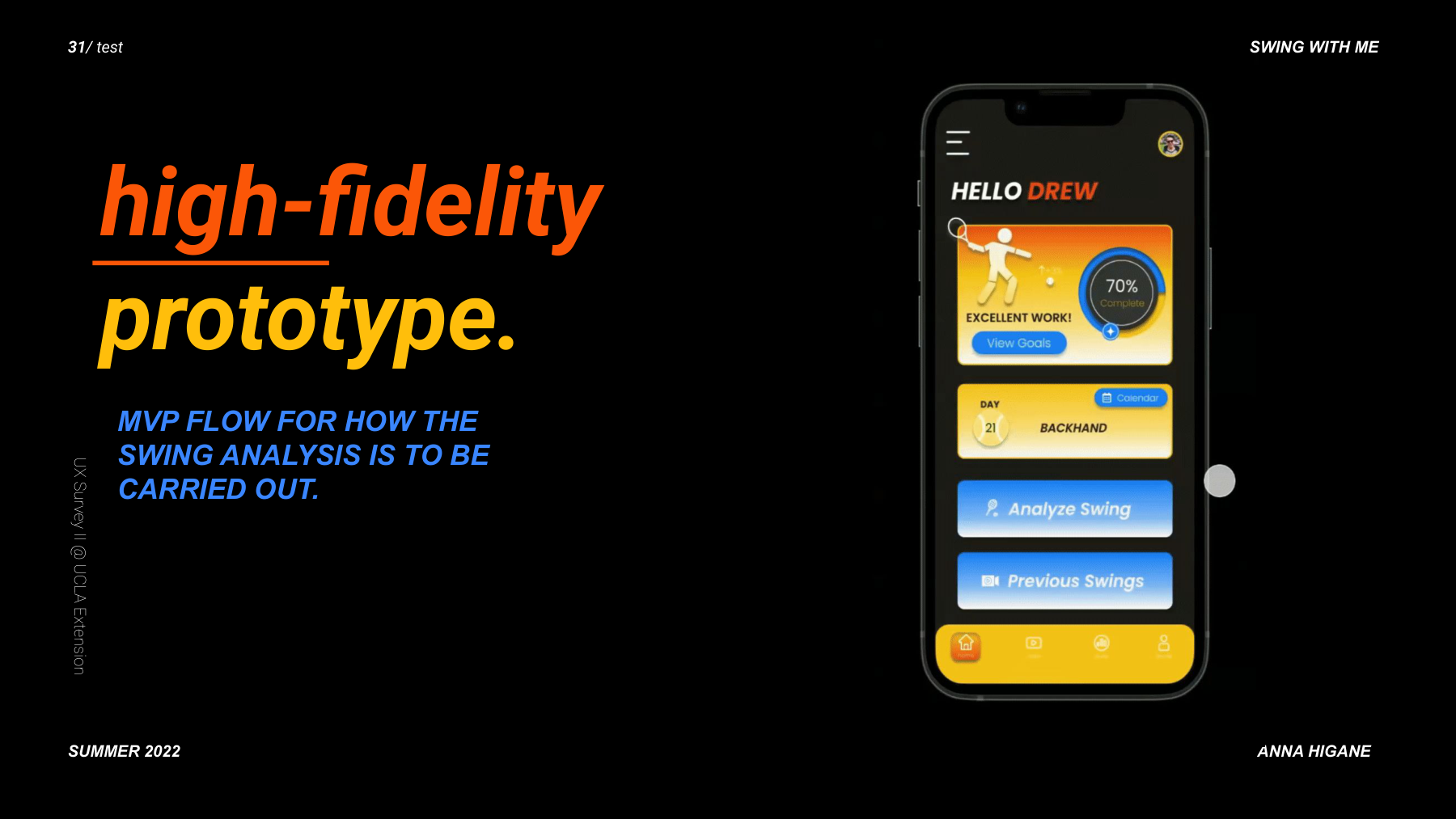
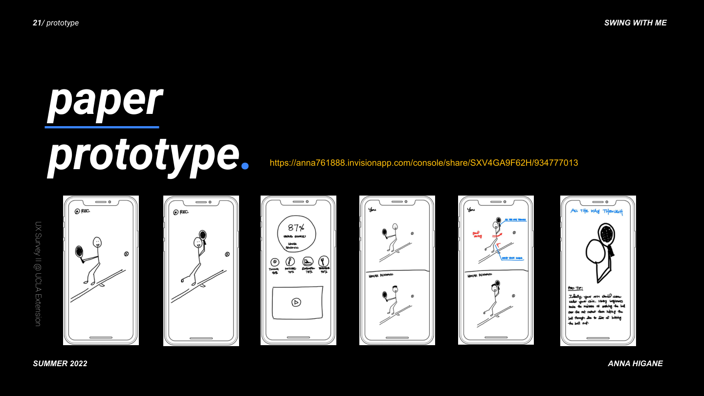
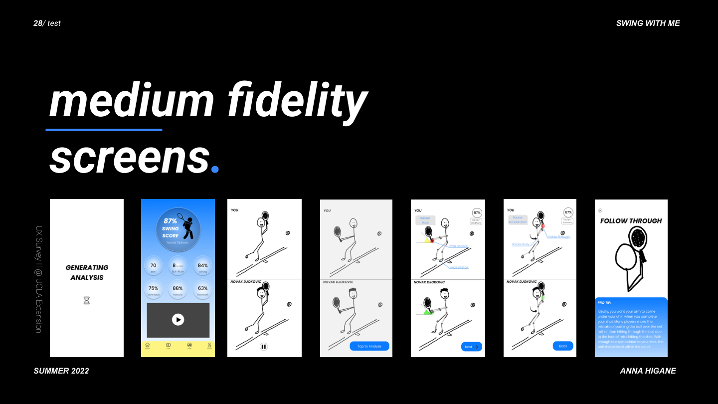
From user flow to paper prototypes to hi-fi — in 12 weeks.
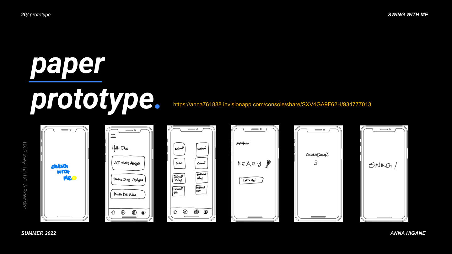
Paper prototyping came first. Every screen started as a sketch before any pixel work.
The design evolved through four distinct fidelity stages. This slide captures the full progression.
04 — Final Design
The real product. Real photography. Real AI feedback.
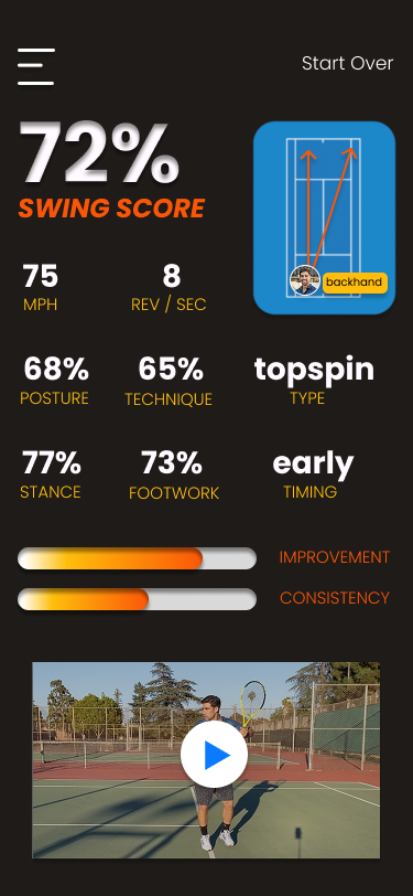
The hi-fi prototype moved from stick figures to real tennis footage, real player comparisons, and a dark-themed UI designed for on-court readability.
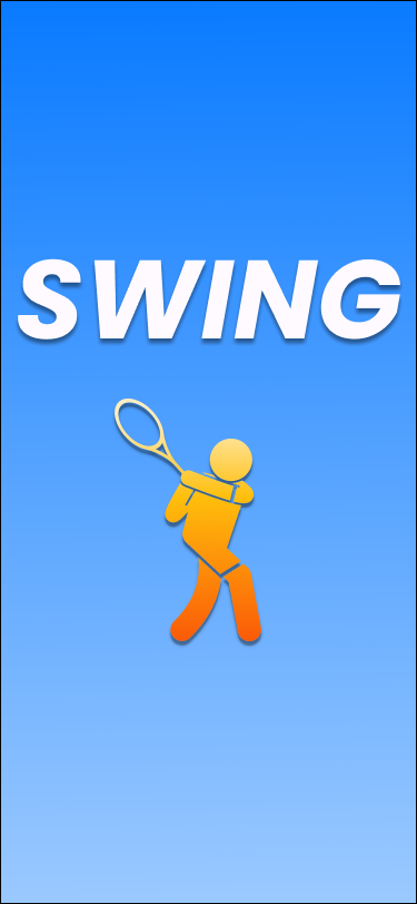
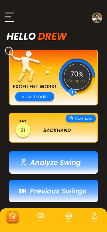
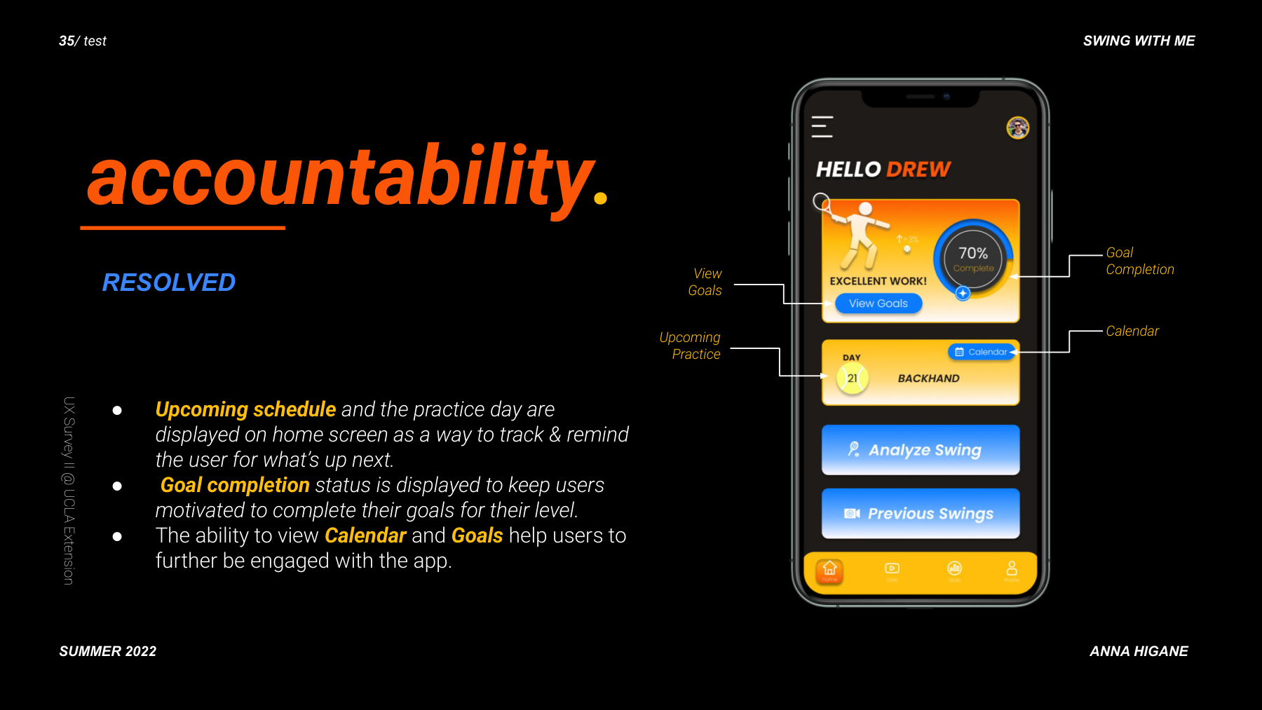
Onboarding — SWING. splash with AI taglineHome — accountability: goals, streaks, daily drills, AI analysis CTA
The core screen: YOUR footage compared frame-by-frame to Djokovic's. Visual cues highlight form differences. Verbal cues explain what to fix. The Follow Through screen delivers specific coaching text.
05 — Testing & Outcome
Five participants. Prioritized features. One key iteration.
All 3 task flows completed without moderator prompting
YOU vs PRO screen required zero explanation
Streak feature was the highest-rated element
One iteration: two CTAs on home screen felt equally weighted, so visual hierarchy was adjusted
06 — Reflection
Challenges, pivots, and what I would do differently.
The AI feedback results were designed as a black box. Participants wanted to understand the reasoning behind their score, not just see the gap. A second iteration would focus entirely on the annotation and scoring explanation layer.